Naskh Calligraphy: Fonts, History, and Free Generator
Explore Naskh (نسخ) — the standardized cursive Arabic script that has been the primary calligraphy of Qur'anic manuscripts, printed Qur'ans, and everyday Arabic reading for over a thousand years. Learn its history, best free fonts (Amiri, Noto Naskh Arabic, KFGQPC Uthman Taha), and generate Naskh Arabic calligraphy free — no sign-up.
✓ 100% Free✓ No Signup✓ SVG Export✓ 11 Styles
Text Input
Font Style
Colors
Transform
Position
Background
WhiteTransparentColorImage
Canvas Size
InstagramFacebookTwitterHD
SquareWideIconBanner
×px
Export
Live Preview800 × 400 px
💡 Drag text to reposition • Use sliders for precise control
What is Naskh Calligraphy?
Naskh calligraphy (خط النسخ, khaṭṭ al-naskh) is the standardized cursive Arabic script that has served as the primary calligraphy of Arabic writing since the 10th century CE. Its name comes from the Arabic word naskh (نسخ) meaning "to copy" or "to transcribe" — reflecting its origin as the script used by scribes to produce copies of the Qur'an and religious texts. Today, Naskh is the script of virtually every modern printed Qur'an worldwide, and its digital descendants (Amiri, Noto Naskh Arabic, KFGQPC Uthman Taha Naskh) are used in newspapers, books, websites, and street signs across the Arabic-reading world.
Naskh is designed for one purpose above all: maximum readability. Its letters are compact, well-proportioned, cursive but restrained, and use consistent stroke weights that render clearly at both small text size and larger display use. Where Thuluth is decorative and ornate, and Kufic is bold and geometric, Naskh is the utilitarian workhorse — the script you actually read.
The tool on this page uses Amiri — the most respected free digital Naskh font, designed by Khaled Hosny in the classical Naskh tradition. Amiri faithfully renders the Naskh style used in traditional Qur'anic manuscripts and printed Qur'ans, with full support for Arabic ligatures, harakat, and proper contextual letter shaping. For most Arabic reading and writing today, if the script is not visibly Thuluth, Kufic, or Diwani, it is almost certainly Naskh or a close descendant.
Naskh Script Characteristics
The Naskh script is defined by five characteristics that together produce its unmatched readability:
1. Compact, well-proportioned letters — Naskh letters are neither exaggerated tall like Thuluth nor blocky wide like Kufic. Each letter fills a comfortable middle proportion designed for reading in extended prose. Vertical letters (alif, lam, ta) are moderately tall; curved letters (nun, ya, ra) sweep naturally without excess flourish. 2. Even, restrained stroke weight — Naskh uses a nearly uniform stroke weight throughout, with only subtle thick-thin variation at letter joins. This produces text that reads smoothly at any size without the visual noise of dramatic weight contrast. 3. Full harakat support — Naskh naturally supports the complete set of Arabic vowel and diacritic marks (fatha, kasra, damma, shadda, sukun), which is why it became the definitive Qur'anic script. Every subtle pronunciation cue can be encoded above or below the letters. 4. Clean cursive joining — Naskh letters connect through simple, hygienic joins that maintain letter individuality. Where Diwani interlocks decoratively and Thuluth flows ornately, Naskh joins are functional and clear. 5. Grid-friendly baseline — Naskh sits on a stable baseline with predictable letter heights, making it the only Arabic script that reliably works for justified columns of text — one reason it dominated Arabic printing from the 15th century onward.
These qualities make Naskh the standard script for reading Arabic. If you have ever seen printed Arabic — in a Qur'an, newspaper, book, website, or road sign — you have almost certainly been reading Naskh or a modernized descendant of it.
Naskh Fonts: Amiri, Noto Naskh Arabic, and KFGQPC Uthman Taha
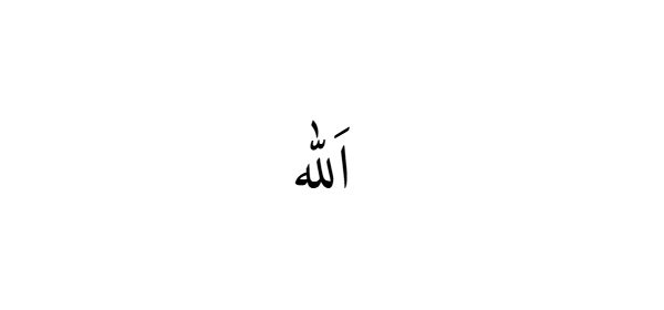
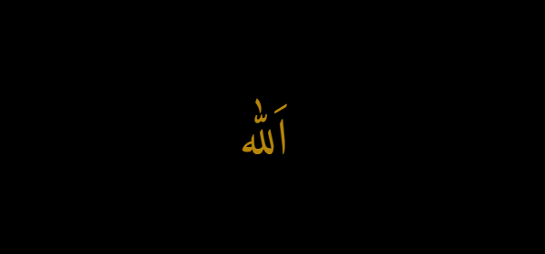
Transparent PNGWhite backgroundBlack background
Three free digital Naskh fonts dominate modern Arabic typography — each with a different focus:
1. Amiri — designed by Khaled Hosny, Amiri is a classical revival of the elegant Naskh style used in the Bulaq Press (Egyptian government printing office, 19th century) editions of Arabic literary and religious texts. Amiri is the closest free font to traditional manuscript Naskh and is what the generator on this page uses. Available free from Google Fonts.
2. Noto Naskh Arabic — designed by Google as part of the Noto ("no tofu") font family, Noto Naskh Arabic is a clean, screen-optimized Naskh with excellent multi-language support. It is the default Arabic font in Android, ChromeOS, and many web contexts. Best choice for websites, apps, and any digital interface where consistent cross-platform rendering matters. Available free from Google Fonts.
3. KFGQPC Uthman Taha Naskh — the official Naskh font of the King Fahd Glorious Qur'an Printing Complex (KFGQPC) in Medina, Saudi Arabia. This is the font printed on the standard Mushaf al-Madinah Qur'an distributed worldwide since 1985 — the most widely printed Qur'an edition in history. Designed by the calligrapher Uthman Taha, it is considered the definitive modern Qur'anic Naskh. Available free from the KFGQPC website; used by countless Qur'an apps and websites.
To download your Naskh calligraphy design from the generator above:
PNG (Transparent) — best for overlaying Naskh text on backgrounds, prayer cards, and educational materials. PNG (White or Black) — great for printed materials, community bulletins, wall art, and framed prints. SVG — best for large prints and posters that need scaling. JPG — smallest file size for casual sharing.
All Naskh calligraphy downloads are free — no watermark, no sign-up, no account required.
Naskh and the Modern Quran
The relationship between Naskh and the Qur'an is one of the deepest in Islamic history. From the 11th century onward, Naskh gradually replaced the earlier Kufic script as the standard calligraphy for Qur'anic manuscripts. The transition was driven by Naskh's superior readability — as Qur'an memorization expanded across the growing Muslim world, a script that could be read fluently by non-experts became essential.
By the 16th–19th century, Naskh had become the almost universal script for handwritten Qur'ans in Ottoman, Persian, Central Asian, and Arab manuscript traditions. Master calligraphers spent years training in classical Naskh — most famously Sheikh Hamdullah (Ottoman, d. 1520), whose Naskh established the modern proportional system, and Hafiz Osman (d. 1698), whose 25+ hand-copied Qur'ans set the standard for later generations.
In the modern printed era, the standard-setting event was the 1985 publication of the Mushaf al-Madinah — the printed Qur'an produced by the King Fahd Glorious Qur'an Printing Complex (KFGQPC) in Medina, Saudi Arabia. The KFGQPC hired the Syrian calligrapher Uthman Taha to hand-write the entire Qur'an in a modern Naskh style, and this handwritten master was then photographed and typeset. Since then, the KFGQPC Uthman Taha Naskh has printed over 300 million copies of the Qur'an distributed to mosques worldwide — making it, by circulation, the most widely reproduced calligraphy in human history.
Today, when you open a Qur'an — printed, digital, or handwritten — you are almost certainly reading Naskh. The other Islamic scripts (Thuluth for chapter headings, Diwani for ornament, Kufic for architecture) surround the Qur'anic text, but the sacred text itself is Naskh.
Naskh vs Thuluth vs Diwani vs Kufic
Naskh is one of the six classical Arabic scripts. Its distinguishing feature is that it is the only one designed primarily for reading rather than decoration. Here's how it compares to the three most common ornamental alternatives:
Naskh vs Thuluth: Thuluth is the ornate ceremonial script used in mosque inscriptions and Qur'anic chapter headings — tall, elegant, and decorative. Naskh is the utilitarian body-text script used for the Qur'anic verses themselves. Every printed Qur'an typically pairs the two: Thuluth chapter titles surrounding Naskh main text. See our Thuluth Calligraphy page for more.
Naskh vs Diwani: Diwani is the ornate Ottoman court cursive, developed for imperial documents and diplomatic correspondence. Naskh is the everyday script — designed for wide reading rather than ceremonial elegance. Diwani says "imperial ornament"; Naskh says "clear communication." See our Diwani Calligraphy page.
Naskh vs Kufic: Kufic is the oldest Arabic script — angular, geometric, monumental. Naskh replaced Kufic as the standard Qur'anic script in the 11th century precisely because it is easier to read. Kufic remains preferred for architectural inscription and modern logo design; Naskh dominates everywhere Arabic must be read fluently. See our Kufic Calligraphy page.
When to choose Naskh: reading and studying Qur'an, Islamic educational materials, printed and digital Arabic text, community mosque bulletins, children's Arabic learning resources, and any project where legibility matters more than decoration.
Famous Phrases in Naskh Calligraphy
Naskh is the script of the printed Qur'an — every religious phrase below appears in Naskh in almost every Muslim's daily reading. Click through to each phrase's dedicated page for full history, meaning, and download options.
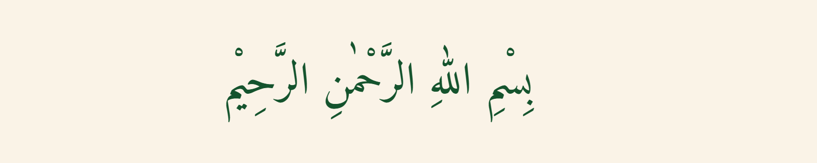
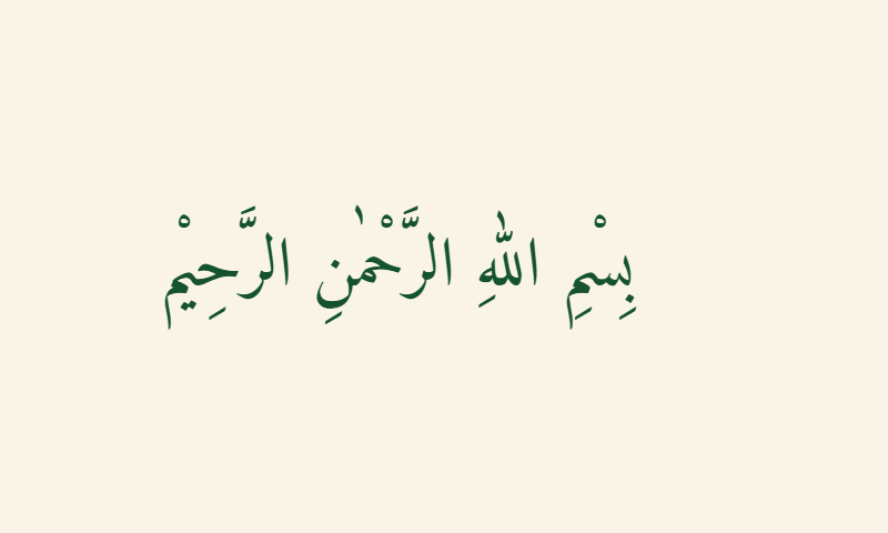
Bismillah in Naskh
Bismillah al-Rahman al-Rahim — the opening verse of the Qur'an — appears in Naskh at the top of every chapter (except Surah 9) in every printed Qur'an. The Naskh rendering is the version most Muslims encounter daily. See our Bismillah in Arabic Calligraphy page for meaning, styles, and downloads.
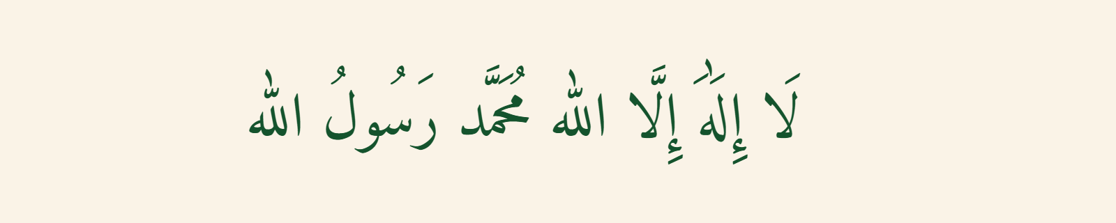
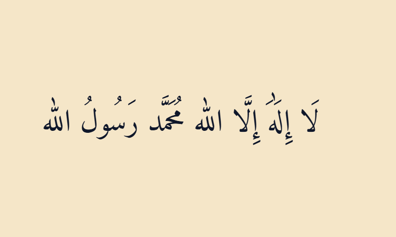
Shahada in Naskh
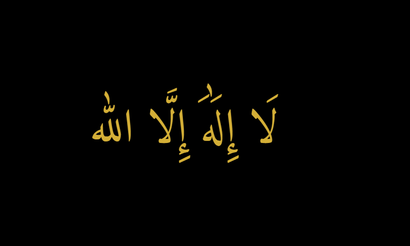
The Shahada — the Islamic declaration of faith — is spoken in Arabic but read in Naskh in every printed Qur'an, prayer book, and Islamic educational material. Its clean Naskh rendering is the version children learn from. See our Shahada in Arabic Calligraphy page for the full declaration and pronunciation.
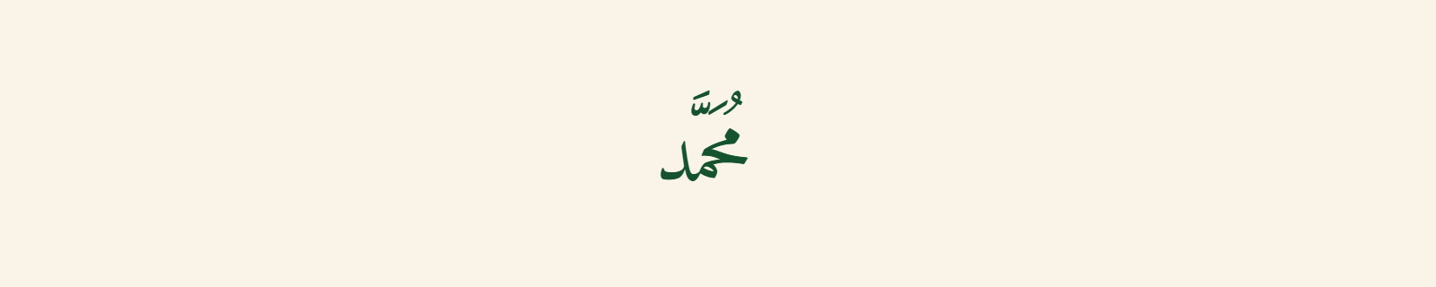
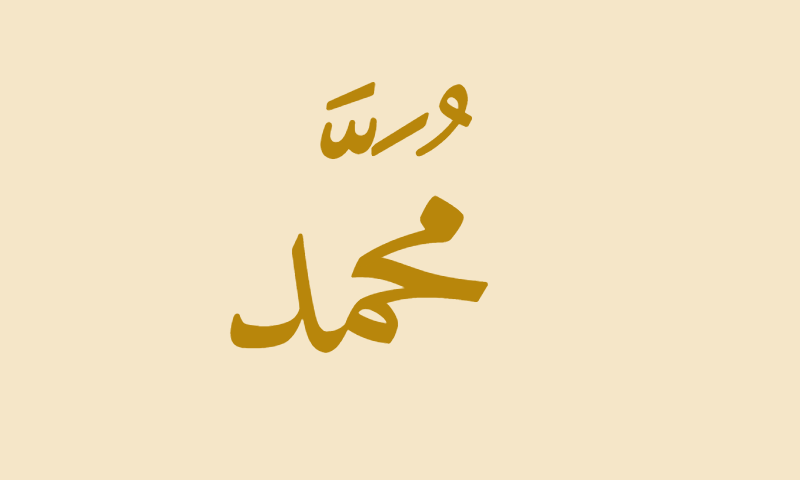
Muhammad in Naskh
The name of the Prophet Muhammad ﷺ appears in Naskh throughout the Qur'an (the name is mentioned four times in the Qur'anic text) and in countless Islamic books, biographies, and educational materials. The Naskh rendering is the version most familiar to Muslim readers. See our Muhammad in Arabic Calligraphy page.
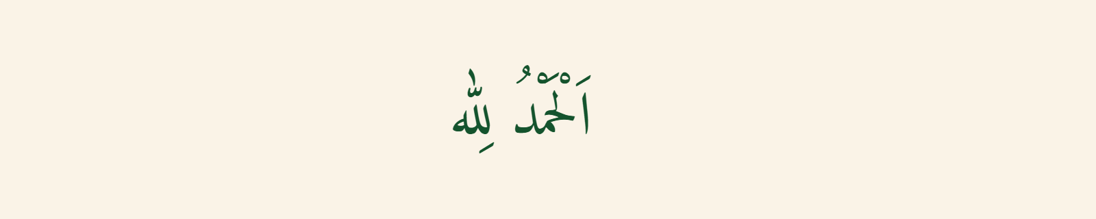
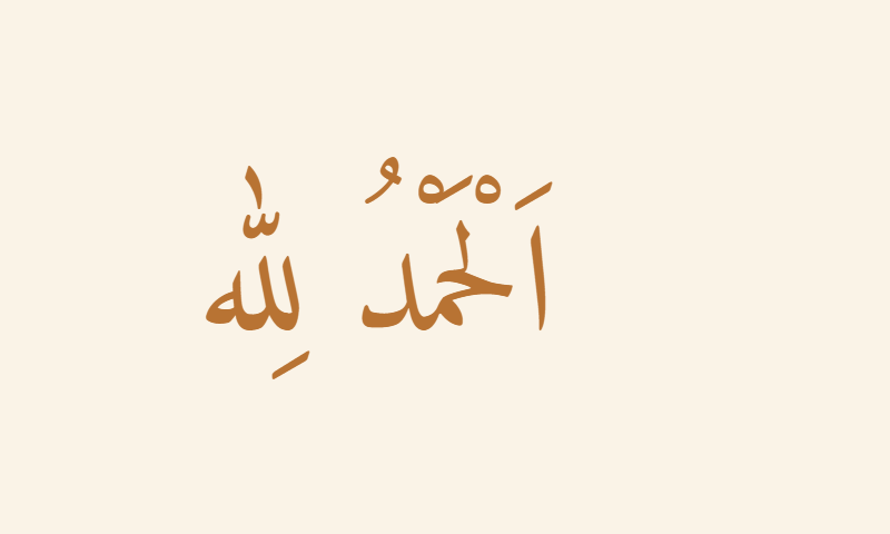
Alhamdulillah in Naskh
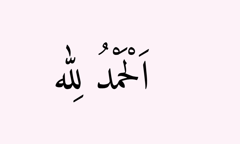
Alhamdulillah — "All praise is due to Allah" — appears in Naskh at the opening of the Qur'an (Surah al-Fatiha, verse 2: al-hamdu lillahi rabbil-alameen). It is one of the first phrases Muslim children learn to read. See our Alhamdulillah in Arabic Calligraphy page.
Featured Naskh Calligraphy Designs
20 hand-picked Naskh calligraphy designs featuring the most common Islamic phrases and names, in colors suited to educational, mosque, and everyday Islamic use. Designs refresh on each visit.
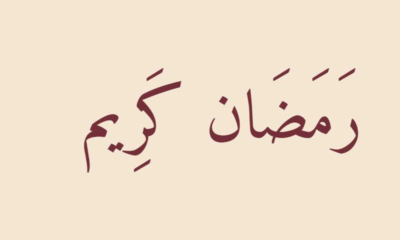
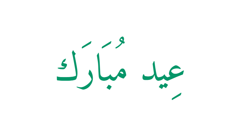
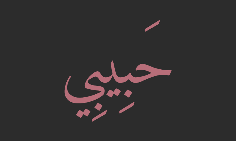
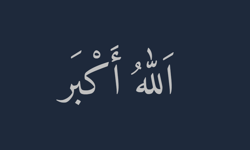
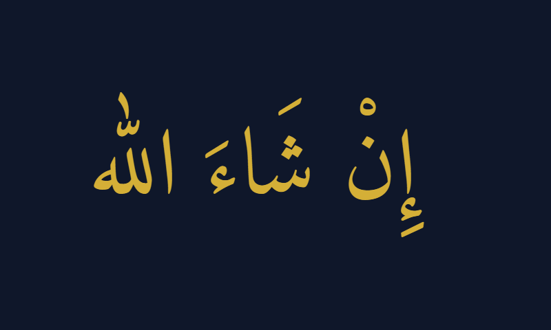
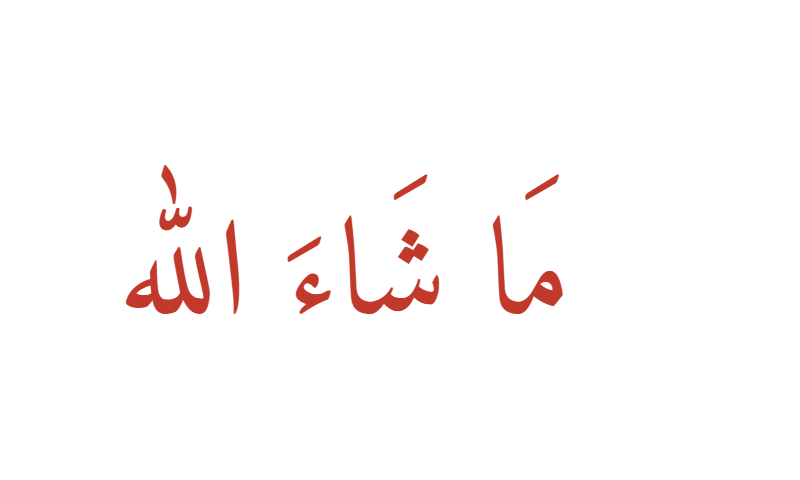
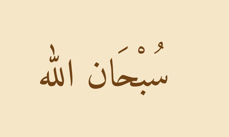
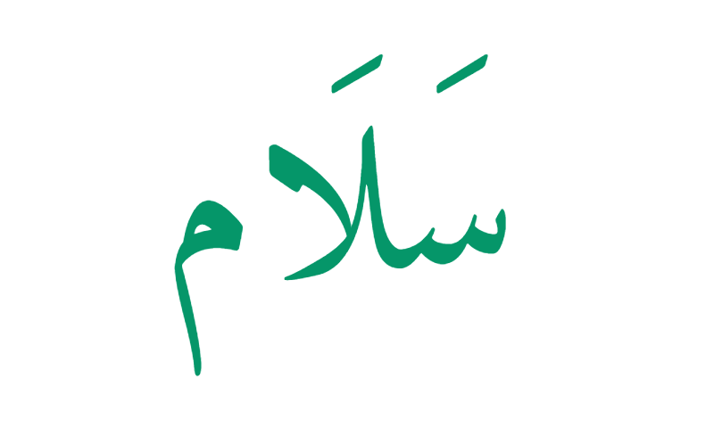
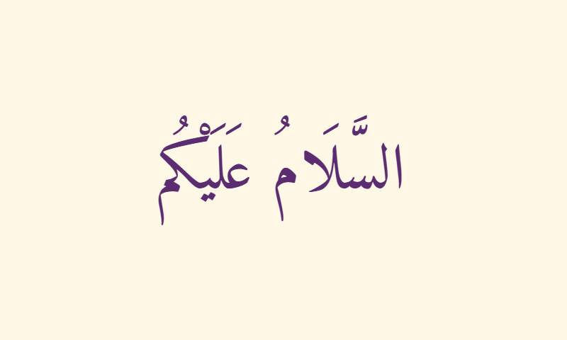
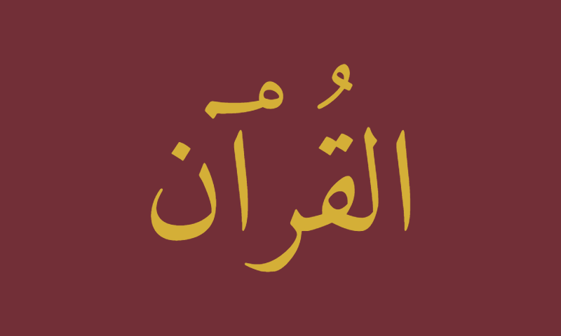
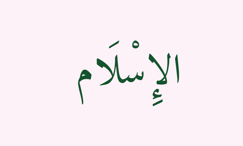
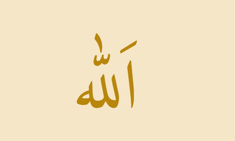
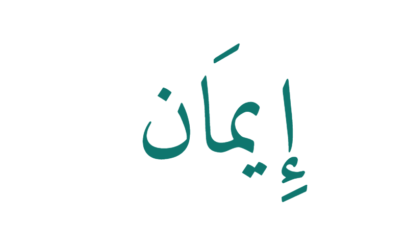
Bismillah · Green · EducationalAllah · Black · ClassicMuhammad · Gold · TraditionalShahada · Navy · Prayer roomAlhamdulillah · Copper · WarmRamadan Kareem · Burgundy · CardEid Mubarak · Emerald · FestiveHabibi · Rose gold · ModernAllahu Akbar · Silver · SleekInsha'Allah · Gold · PremiumMasha'Allah · Red · BlessingSubhanallah · Sepia · VintageSalam · Green · PeaceTawhid · Gold · SacredAssalamu Alaikum · Purple · GreetingAl-Quran · Gold · Book coverAl-Islam · Green · EducationalAllah · Gold · ClassicalAlhamdulillah · Black · SoftIman · Teal · Faith
Frequently Asked Questions
What is Naskh calligraphy?
+
Naskh (نسخ) is the standardized cursive Arabic script that has been the primary calligraphy of Qur'anic manuscripts and printed Qur'ans since the 11th century. Its name means "to copy" or "to transcribe," reflecting its origin as the script used by scribes to produce Qur'an copies. Naskh is designed for maximum readability — compact letters, even stroke weight, full harakat support, and clean cursive joining — making it the standard script for virtually all modern printed Arabic.
What is the best free Naskh font?
+
The three best free Naskh fonts are: (1) Amiri — the closest to traditional manuscript Naskh, designed by Khaled Hosny, used by the generator on this page; (2) Noto Naskh Arabic — Google's screen-optimized Naskh with excellent cross-platform support; (3) KFGQPC Uthman Taha Naskh — the official font of the standard Mushaf al-Madinah Qur'an printed in Medina, Saudi Arabia. All three are free to download and use.
What is KFGQPC Uthman Taha Naskh?
+
KFGQPC Uthman Taha Naskh is the official Naskh font of the King Fahd Glorious Qur'an Printing Complex (KFGQPC) in Medina, Saudi Arabia. It was hand-drawn by the Syrian calligrapher Uthman Taha and became the font of the standard Mushaf al-Madinah Qur'an, which has been distributed in over 300 million copies worldwide since 1985 — making it the most widely reproduced calligraphy in human history. It is available free from the KFGQPC website.
What is the difference between Naskh and Thuluth?
+
Naskh is the utilitarian everyday Arabic script used for reading — compact, cursive, and clear. Thuluth is the ornate ceremonial script used for mosque inscriptions, Qur'anic chapter headings, and formal Islamic art — tall, decorative, and flowing. Every printed Qur'an typically uses both: Thuluth for chapter titles and Naskh for the sacred text itself. If Naskh is the newspaper font of Arabic, Thuluth is the wedding-invitation font.
Why is Naskh the script of the modern Quran?
+
From the 11th century onward, Naskh gradually replaced the earlier Kufic script as the standard Qur'anic calligraphy because Naskh is dramatically easier to read fluently. As Qur'an memorization spread across the growing Muslim world, a legible script became essential. Naskh remained the standard through Ottoman manuscript tradition and became the definitive modern Qur'anic script with the 1985 publication of the Mushaf al-Madinah in KFGQPC Uthman Taha Naskh — an edition printed in over 300 million copies.